New Visual for our Reception Area at our European HQ
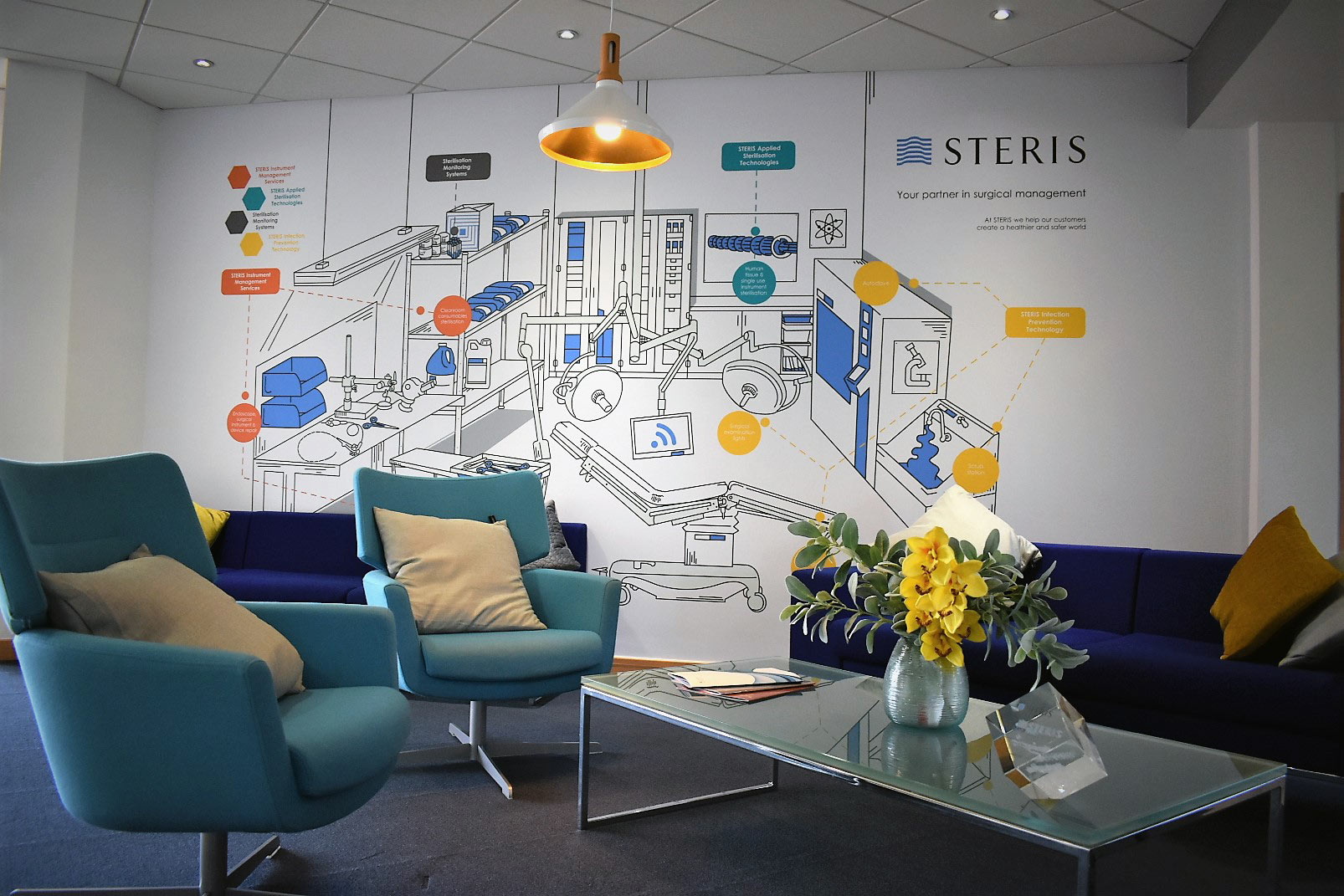
As part of the rebrand and merger process for STERIS and Synergy Health we developed a new visual for our reception area at our European HQ for STERIS Instrument Management Services.
For the final stage of the Rutherford House reception rebrand project, the project team commissioned an infographic. This graphic replaces the Synergy Health world map that was previously on the wall in the seating area.
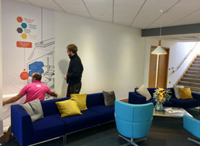
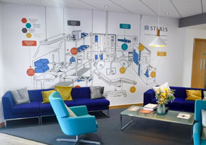
The brief for this graphic was to create an illustration that would demonstrate the STERIS services and how they all come back to the patient, we wanted to highlight and visualise key areas within the STERIS business from the various divisions all working within Rutherford House such as, Instrument Management Services and Applied Sterilisation Technology.
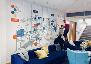
The project team hired Ben Blacknall to complete this illustrated graphic. Ben currently works within facilities team at Rutherford House and is located in the Reception area. In his spare time, Ben is an illustrator and has also illustrated children’s books in the past. The project team provided Ben with a brief of the project and took him to a couple of the different STERIS sites so that he would be able to experience our many processes first hand to help with the inspiration of the graphic.
Having Ben complete the infographic really helps to give it a personal, in house feel. On project completion, we met with Ben to ask him about his experience creating the infographic and the processes that took place “behind the scenes”. Here is what he had to tell us:
What was the inspiration behind the style of the graphic?
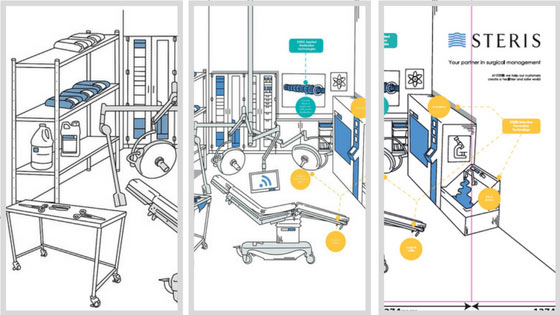
All my art, design and illustrations are simple and minimalistic. I’ve always loved contour drawing and how an artist can tell a story from just a few lines, Picasso was great at doing this. The inspiration for this particular illustration was firstly from Sept 4th Edition of the New Yorker Magazine. Bruce Eric Kaplan is a great cartoonist and that cover really caught my eye. I was already aware this STERIS illustration would be blown up large, for a wall in our reception and most of the time less is more when doing BIG pieces. I knew I should keep it to simple outlines. Secondly the ‘Beano’. As a child, I loved those comics and would spend hours examining the line work. I really wanted to include the scratchy lines Leo Baxendale used for shading and to illustrate movement in the Beano for this piece.
How did you research each element of STERIS to establish what would be included within the graphic?
I started by studying the websites which helped at first, but soon became information overload to understand ‘what was the most important?’. So, to do this we decided it would be good for me to do some sites visits. That way I could get a real feel of how our business works and prioritise what needed to be included in this illustration.
What did you find the most interesting about each of your site visits?
Wow, tough question. Every site was impressive in its own way. So well organised and immaculately run. If I was to list what was the most interesting. The Gamma sterilization process at AST was very cool. The German engineered machinery used at Albert Browne and how the staff work alongside was really impressive and actually satisfying to watch how precise the packaging is completed. The surgical instrument repairs at Hoddesdon was interesting. How well an instrument can be brought back to life and looking brand new from using quite traditional methods by hand. The capabilities of an endoscope camera and how tiny the lenses are, to repair something that small and intricate is incredible. Last but no way least the process at Instrument Management Services was so well managed and pristine (compared to how the instruments are received).
What perception do you want the viewer to have of STERIS as a company based on your graphic?
Each element of the company is unique in its own way, but we are all one team, STERIS. We all have one goal, the patient. As unrealistic as it may seem seeing all of our processes and equipment in one room under one roof, that’s what I wanted to show off.
One team, One goal, with the central viewing point being the patient, hence the operating table. I want anyone from the company to walk past and be able to spot at least one part of the illustration that is relevant to what they do at STERIS, but at the same time be an infographic for visitors and Customers.
What was the medium used to produce this graphic and the processes involved?
I always start off with good old pen and paper, just to get a very rough idea of how to use the space available. On this occasion, it was great as the wall to be used is basically a giant landscape piece of paper. Once I have a good feeling with the scale and size I then complete my illustrating on a tablet, the iPad Pro and Apple pencil using Procreate software. I really don’t enjoy drawing with a mouse and keyboard but a tablet is so close to pen and paper you get the best of both worlds. This isn’t the first piece I’ve done intended for public viewing or to be blown quite large so due to that the image needs to be vectored once hand drawn. That I do as a collaboration with a buddy of mine Gavin Morgan. He’s a wiz with Adobe and a talented Graphic Designer and we have worked on many projects together in the past. He vectored this piece, identically to how I illustrated, to allow us to blow it up to the size of a wall.
Did you face any challenges during the creation of the infographic?
Yes. Usually my art comes from my imagination, however this needed to be relatable, corporate and informative. I needed to fit so much into one room and prioritising was difficult. Also, I very rarely work with typography and as much as I wanted the drawing to do the talking for the staff, I needed to consider the visitors and Customers that would view this infographic, this is where the call outs came into play.
Finally, what was your favourite part of this project?
Early stages of page layout and sketching is always exciting. When you can imagine what it will look like before its actually on paper is always a drive to get started. Liaising with Kat and Aimee over the project was fun as I rarely get the chance to hear feedback or opinions on something I’m drawing before its actually finished. Their input was very helpful. Matching the call out colours to our reception furniture was new to me and I really liked that interior design part of the task. The site visits were also enjoyable and visiting these sites and meeting the people that make STERIS what we are makes me even more proud to be working for STERIS.